
If your Shopify store is seeing plenty of traffic but struggling to turn visitors into customers, the issue might lie in your user experience (UX). A poor UX can frustrate shoppers, drive them away, and tank your conversion rates. The good news? Most UX problems are fixable with targeted tweaks. In this blog, we’ll dive into five common UX mistakes that could be sabotaging your Shopify store’s performance and provide practical solutions to boost conversions. Let’s get started.
The Problem: Low Conversion Rates Due to Poor User Experience
Conversion rates—the percentage of visitors who complete a desired action, like making a purchase—are a critical metric for any Shopify store. Industry benchmarks suggest eCommerce conversion rates typically hover between 1% and 3%, but poor UX can drag yours far below that. Common culprits include confusing navigation, sluggish load times, unclear calls-to-action (CTAs), cluttered designs, or a checkout process that feels like a maze. These issues create friction, erode trust, and send potential customers straight to your competitors.
The solution lies in identifying and fixing these UX bottlenecks. Below, we’ll unpack five frequent mistakes and show you how to address them with strategies like optimizing site speed, simplifying menus, clarifying CTAs, and using A/B testing to fine-tune your design.

Mistake 1: Confusing Navigation That Loses Shoppers
The Issue
If visitors can’t find what they’re looking for within seconds, they’re gone. Complex or illogical navigation—think nested menus, vague category names, or a lack of search functionality—makes browsing a chore. For example, labeling a category “Essentials” might sound trendy, but if it’s unclear whether it means clothing, accessories, or something else, customers will bounce
The Fix
Simplify Your Menu Structure: Limit top-level menu items to 5–7 clear categories (e.g., “Men,” “Women,” “Sale”). Use descriptive names that match what customers expect.
Add a Prominent Search Bar: Shopify’s built-in search feature is a lifesaver. Place it in the header and ensure it supports autocomplete for faster results.
Use Breadcrumbs: These help users track their path (e.g., Home > Clothing > T-Shirts) and backtrack easily.
Test with Real Users: Tools like Hotjar or Crazy Egg show how visitors navigate your site, revealing where they get stuck.
Pro Tip
Run a quick test: Can a new visitor find a specific product in under 10 seconds? If not, it’s time to streamline.
Mistake 2: Slow Load Times That Kill Patience
The Issue
Speed matters. Studies show that 53% of mobile users abandon a site if it takes longer than 3 seconds to load. Slow load times—often caused by oversized images, bloated themes, or too many apps—frustrate shoppers and hurt your SEO, as Google penalizes sluggish sites.
The Fix
- Optimize Images: Compress images using tools like TinyPNG before uploading. Shopify’s image editor can also resize files to fit your theme.
- Choose a Lightweight Theme: Opt for a fast-loading Shopify theme like Debut or Turbo. Avoid feature-heavy themes unless you need every bell and whistle.
- Limit Apps: Audit your Shopify apps and remove any that aren’t essential. Each one adds code that can slow your site.
- Use a Content Delivery Network (CDN): Shopify includes a CDN, so ensure it’s enabled to serve content faster globally.
- Test Your Speed: Run your store through Google PageSpeed Insights or GTmetrix to pinpoint issues and get tailored recommendations.
Pro Tip
Aim for a load time under 2 seconds on mobile and desktop. Every second shaved off can boost conversions by up to 7%.

Mistake 3: Unclear or Missing Calls-to-Action (CTAs)
The Issue
If your “Add to Cart” or “Buy Now” buttons blend into the background or compete with other elements, customers might not know what to do next. Weak CTAs—like tiny buttons, vague text (e.g., “Continue” instead of “Shop Now”), or too many competing options—create hesitation and lower conversions.
The Fix
- Make CTAs Stand Out: Use contrasting colors (e.g., a red button on a white background) and ensure buttons are large enough for mobile taps.
- Use Action-Oriented Text: Swap generic phrases for specific, urgent ones like “Add to Cart,” “Get Yours Now,” or “Claim Your Discount.”
- Place CTAs Strategically: Position them above the fold (visible without scrolling) on product pages and repeat them at logical intervals.
- Reduce Distractions: Limit secondary CTAs (e.g., “Learn More”) near primary ones to keep the focus on purchasing.
- A/B Test Variations: Use Shopify apps like Shogun or Optimizely to test different button colors, sizes, or text to see what drives clicks.
Pro Tip
Check your product pages: Is the primary CTA the most eye-catching element? If not, redesign it to steal the show.
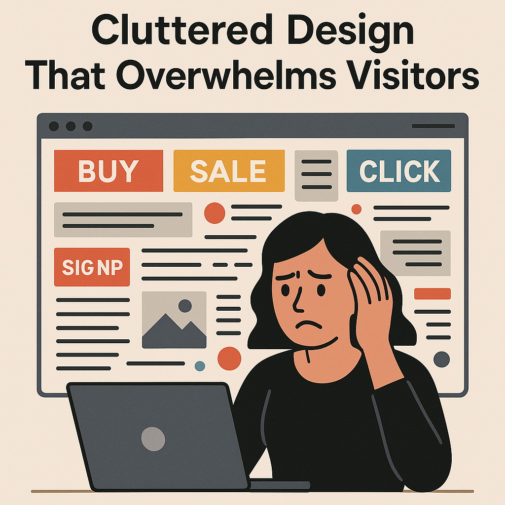
Mistake 4: Cluttered Design That Overwhelms Visitors
The Issue
A busy design—think flashy banners, endless popups, or walls of text—can overwhelm shoppers and obscure your products. Clutter dilutes your message and makes it hard for customers to focus on what matters: buying. For instance, a homepage with 10 competing promotions might look lively but often confuses rather than converts.
The Fix
- Embrace White Space: Give elements room to breathe. A clean layout highlights products and improves readability.
- Prioritize Key Content: Feature your bestsellers or promotions prominently, and tuck less urgent info (like blog links) in the footer.
- Limit Popups: Use exit-intent popups instead of bombarding users on arrival. Tools like Privy can time them smartly.
- Streamline Product Pages: Include only essential details—high-quality images, concise descriptions, price, and CTA. Save reviews or FAQs for expandable sections.
- Follow Design Best Practices: Use consistent fonts (no more than two), a cohesive color scheme, and mobile-friendly layouts.
Pro Tip
View your store on a small screen. If it feels chaotic, strip away non-essential elements until it’s clean and focused.
Mistake 5: A Complicated Checkout Process
The Issue
The checkout is where conversions live or die. A clunky process—too many steps, mandatory account creation, or surprise fees—leads to cart abandonment. Shopify’s data shows that 70% of carts are abandoned, often because checkout feels like a hurdle.
The Fix
- Enable Guest Checkout: Let customers buy without creating an account. Shopify’s default settings support this—make sure it’s active.
- Minimize Form Fields: Only ask for essentials (e.g., name, email, shipping address, payment). Use autofill features to speed things up.
- Show Progress Indicators: Display a clear “Step 1 of 3” bar so users know what’s left.
- Be Transparent About Costs: Show shipping fees early, ideally on product pages, to avoid sticker shock.
- Offer Multiple Payment Options: Shopify Payments supports cards, PayPal, Apple Pay, and more. Enable them to suit different preferences.
- Test Checkout Flow: Use Shopify’s analytics or tools like FullStory to spot where users drop off and simplify those steps.
Pro Tip
Try checking out on your own store as a customer. If you feel annoyed or confused at any point, so will your shoppers.

Bringing It All Together: The Power of A/B Testing
Fixing these UX mistakes isn’t a one-and-done task—your store’s needs will evolve. That’s where A/B testing comes in. By comparing two versions of a page (e.g., one with a red CTA button vs. a blue one), you can see what resonates with your audience. Shopify apps like VWO or Google Optimize make this easy. Test one change at a time—navigation layout, button text, or checkout fields—to isolate what drives conversions.
Start with the highest-impact areas, like your checkout or product pages, and monitor your conversion rate in Shopify’s analytics dashboard. Small tweaks can lead to big gains: even a 0.5% increase in conversions can add thousands in revenue over time.
Why These Fixes Matter
A seamless UX doesn’t just boost conversions—it builds trust and loyalty. Customers who enjoy shopping on your Shopify store are more likely to return and recommend it to others. By addressing confusing navigation, slow load times, weak CTAs, cluttered designs, and checkout friction, you’re not just fixing problems—you’re creating a better experience that sets your brand apart.
Ready to Boost Your Shopify Conversions?
At Digital Pro, we specialize in turning Shopify stores into conversion machines. From optimizing UX to crafting data-driven marketing strategies, we’re here to help you grow. Want a free UX audit to uncover what’s holding your store back? Contact us today and let’s get your conversions soaring.
Read More :-
Abandoned Carts Killing Your Sales? 6 Proven Strategies to Recover Lost Revenue
SEO for Shopify: How to Rank Higher Without Breaking the Bank
Struggling to Stand Out? How to Build a Unique Shopify Brand on a Budget